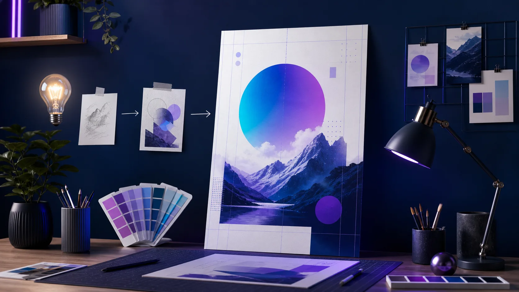
How to Make a Poster With AI: A 7-Step Workflow That Avoids Unreadable Text
Learn how to make a poster with AI that people can actually read: plan the message, prompt for a visual system, then verify text, contrast, and size before you print or post.
You open an AI poster tool, type a prompt, and thirty seconds later get something that looks great at full size on your monitor. Then you export it, share it on Instagram, and the headline is misspelled, the date is wrong, or the text is unreadable on a phone screen. So you regenerate, and the new version looks worse.
That failure loop is the real problem with making posters with AI, and it is almost never about the model. It is about treating one generated image as a finished poster instead of a starting composition. The poster's job is to make people act on accurate information — and AI image generation is not reliable at writing that information yet.
This guide gives you a repeatable seven-step workflow: define the job, choose the destination first, write the copy separately, prompt for the visual system, generate options, edit the critical text, and check the export at its real size. By the end, you will be able to produce an AI poster you can actually publish — without the regenerate-and-pray cycle. Open Text to Poster AI when you are ready to create; the separate tool, editing, and print workflow explains what to evaluate before committing to any generator.
Before You Start: The One Rule That Changes Everything
Keep AI output as a composition draft until the required information has been checked and edited.
Most tutorial guides stop at "generate." This one adds a review gate. A poster has failed if a viewer cannot identify the message in three seconds, read it on a phone, and act on it. Everything below exists to get you through that gate.
Step 1: Define One Job for the Poster
Every poster does one of five jobs: sell (a product, a seat, a ticket), invite (an event, a workshop), announce (news, a launch), explain (an idea, a process), or decorate (a mood, a brand statement).
Write the job down in one sentence before you design anything:
- Sell → the offer and the price are the non-negotiables.
- Invite → the date, time, venue, and registration are the non-negotiables.
- Announce → the headline and what changed are the non-negotiables.
- Explain → the takeaway and one supporting visual are the non-negotiables.
Rule of thumb: if you cannot say the job in one sentence, you are not ready to prompt. Every design decision below should serve that one sentence.
Step 2: Choose the Destination Before the Size
The viewing context decides the layout, not your taste. Pick one primary destination:
- A phone feed or story (portrait, large headline, very little detail)
- A social post or carousel (square or 4:5, medium detail)
- An A4 handout or A3 noticeboard (people hold it or walk past it)
- A large wall or window display (bold type, minimal text)
Different formats create different reading behavior. A person scrolling a feed gives the image a glance; a person walking past a poster gets a few seconds at distance; a person holding a handout can read a paragraph. If the same campaign needs both print and social, design the hierarchy once, then create a separate canvas for each ratio — don't stretch one design.
Aspect ratio is a composition decision, not an afterthought. Changing from 9:16 to 16:9 reflows the whole layout, so choose it in Step 2, not at export time.
Step 3: Write the Non-Negotiable Copy in a Separate Note
Before opening a generator, type every fact the poster must contain into a plain text note:
- Title or headline
- Date and time
- Venue or online location
- Price or offer
- URL or contact
- Any legal wording (privacy note, terms, accessibility line)
This is your source of truth. When you edit the poster later, every word on the design gets checked against this note — never against the AI output.
Rule of thumb: the AI generates the picture; you own the facts. If a fact changes after generation, correct the wording instead of regenerating the whole image. PosterMont keeps the generated poster as a flat image and applies OCR-assisted image editing for text corrections; use a separate design editor when you specifically need independent text layers.
Step 4: Prompt for the Visual System, Not for the Text
The most useful prompts describe the visual system and the space, and ask the model to keep in-image text out of the way. One to three direct sentences work better than adjectives such as "amazing":
Create a vertical poster for a neighborhood night market.
Leave clear space at the top for the headline and at the bottom for date and location.
Warm coral, navy, and cream; friendly screen-printed texture; one central food-stall scene.
Notice what this prompt does: it states the purpose, the main subject, the mood, the palette, and the layout constraint, and it reserves space for text. If you want specific words in the image, put them in quotation marks and specify placement, size, color, and style — but expect to verify or replace them in the next step.
Avoid asking for dense text in the image. Short headline-style words survive better than paragraphs, and even they should be treated as placeholders.
Step 5: Generate Several Options, Then Choose the Clearest Composition
Generate at least three directions. Choose based on clarity, not on which image is most detailed:
- Is there a calm, readable path through the composition?
- Is the empty space where text will go actually empty?
- Does the subject support the message instead of competing with it?
- Would it still work as a thumbnail?
A beautiful image with no usable text space fails the test. A simpler image with a clear headline area passes it. If nothing fits, adjust the prompt and generate again — but limit this loop to a few rounds before moving to editing.
Step 6: Edit All Business-Critical Text Manually
This is the step the tutorials skip, and the step that separates a usable poster from a pretty failure.
Check the headline, date, price, URL, and call to action against your verified copy from Step 3. In PosterMont, use Edit Text to detect wording with OCR and generate a corrected image, or use targeted repaint for other local fixes. If your production workflow requires live text objects, move the final copy into a separate design editor. Pay special attention to:
- Spelling of names, venues, and URLs
- Dates, times, and prices
- The call to action — does it still work in a small preview?
- Contrast between the text and its background (W3C's minimum contrast guidance is a useful baseline)
- Text sitting on busy texture — add a solid panel or darker band behind key copy if needed
If generated in-image text is wrong, correct it with OCR-assisted image editing, crop or cover it, or move the final copy into a separate editor. The goal is a design where the facts are real and the artwork supports them.
You can start from a scene template and refine it: pick a poster style that matches the job, then replace the placeholder copy with your verified facts in the editor.
Step 7: Export a Channel-Specific Version and Inspect It at Real Size
Export one version for the destination you chose in Step 2, and check it where people will actually see it:
- Phone: open it on your phone and view it at 100%, not zoomed. Can you read the headline without pinching?
- Feed: check it at thumbnail size. Does the message survive a small preview?
- Print: check the required dimensions, resolution, bleed, and safe area with your printer before ordering. Match the file to the printer's specification, not to a generic online checklist.
Then run the three-second test: show the export to someone unfamiliar with the project for three seconds and ask what the poster is about and what to do next. If they hesitate, simplify the image or give the text more contrast and space.
A Small Review Checklist
- Is the headline the first thing the eye sees?
- Are every name, date, price, and URL spelled correctly and verified?
- Does the call to action still work in a small preview?
- Is there enough contrast behind the key copy?
- Does the file match the destination's required dimensions and format?
- Would the design still work if viewed in grayscale?
FAQ
Can AI make a poster with accurate text? AI image models can render short text in images, but they are not reliable enough for business-critical copy like dates, prices, URLs, and legal wording. The practical approach is to use AI for the visual composition, verify every critical string, and correct the rendered wording afterward. PosterMont uses OCR-assisted image editing rather than independent text layers.
How long does it take to make a poster with AI? A usable draft takes minutes: a few prompt iterations for the visual direction, then time to add and verify the real text. Most of the effort is in the editing and proofing steps, not the generation.
What is the best size for an AI poster? There is no single best size. Choose the size that matches the destination: portrait for phone feeds and stories, 4:5 or square for social posts, A4/A3 for handouts and noticeboards, and larger formats for wall displays. Decide the aspect ratio before prompting, because it changes the composition.
Why does AI-generated poster text look wrong? Text generation in images is an area where diffusion and similar models still struggle, especially with long strings, unfamiliar names, and small glyphs. The reliable fix is not a better prompt — it is editing the text after generation.
Can I use an AI poster for commercial purposes? Usage rights depend on the tool you use and what the image contains. Check the tool's terms for commercial use, and confirm you have rights to any photo, logo, or person depicted. For AI-specific questions, the U.S. Copyright Office publishes guidance on AI-assisted work.
Where This Guide Goes Further Than Typical Prompt Lists
Prompt lists usually stop after generation. This workflow adds the part that makes a poster publishable: a review gate with a three-second test, a copy source of truth that survives design changes, a contrast check, and a channel-specific export. The AI proposes the visual system; you control the information.
Start from a prompt or a scene template in the AI Poster Generator, then refine the layout before export. If you are starting from a photo, upload it as the subject reference and describe what must remain unchanged. For print jobs, pair this workflow with the print-ready poster guide and the standard poster sizes guide.
Sources
This article applies official guidance for prompt clarity, image accessibility, text contrast, and print preparation. Requirements vary by tool and print provider; always verify the final specification with the party that will publish the poster.
- OpenAI Academy: Creating images with ChatGPT
- OpenAI Help: Prompt engineering best practices
- W3C: Images tutorial
- W3C: Understanding contrast minimum
- W3C: Understanding use of color
- ISO: ISO 216 paper sizes
- Adobe: Print bleed and slug areas
- PDF Association: PDF/X
- U.S. Copyright Office: Copyright and AI
- Creative Commons: License chooser
Author
The product team building and testing PosterMont. Product guidance is checked against the current app, and design references cite their sources and state model or export limits.
Categories
More Posts
AI Movie Poster Prompts: A Formula and 12 Examples That Leave Room for a Title
Use this AI movie poster prompt formula — genre, character, tension, setting, light, composition, title space, format — with 12 starting directions you can adapt.
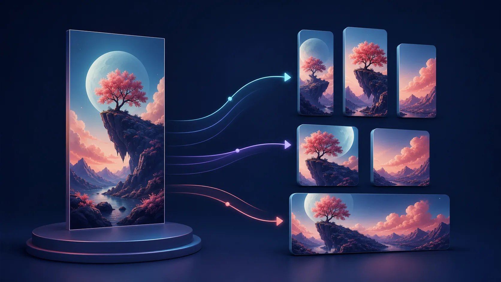
How to Adapt a Poster for Social Media Without Ruining the Design
Turn one poster campaign into useful social-media variants: protect the hierarchy, rebuild for each ratio, and preview every export on the device before posting.
How to Choose Poster Colors: A Simple AI Workflow for Contrast and Mood
Choose a poster palette that supports the message, the audience, and readable text — with a three-step method, a constrained AI prompt, and a contrast review.
Newsletter
Join the community
Subscribe to our newsletter for the latest news and updates