How to Make an Event Poster With AI That People Can Actually Read
A step-by-step guide to making an AI event poster with a clear hierarchy for the event name, date, venue, and call to action — and no missing logistics.
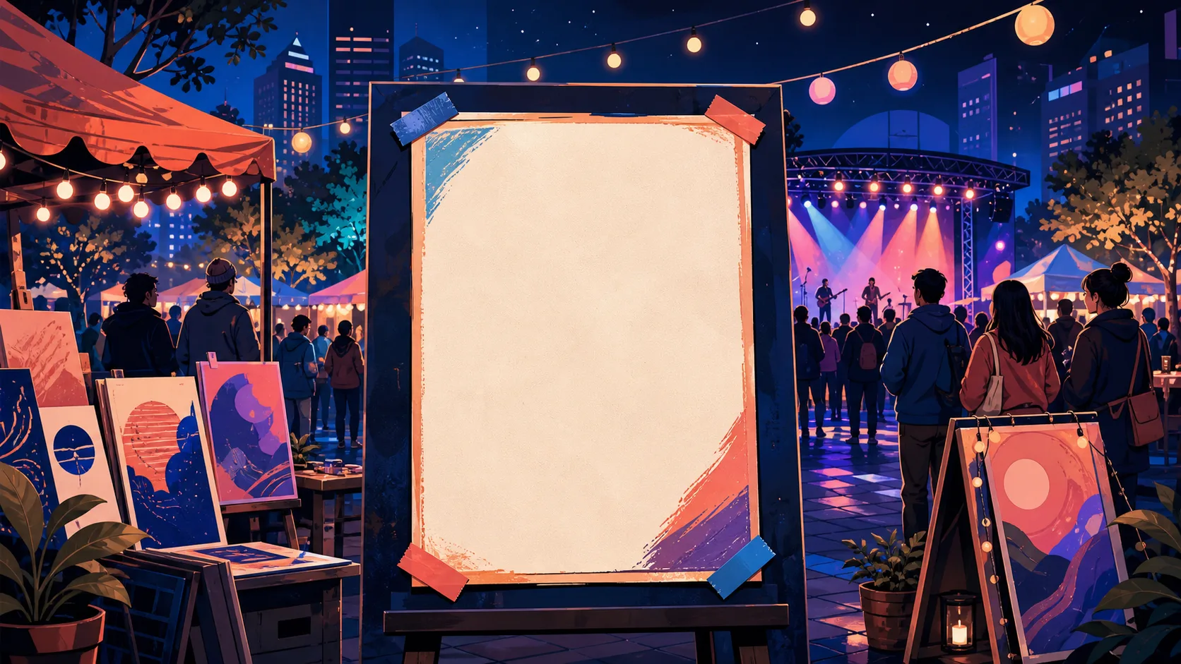
You make a beautiful poster for a charity run, share it, and the first comment is "when and where is it?" The image is stunning, but the logistics — the date, the time, the venue, the registration link — are buried in a texture that nobody can read at a glance. The poster fails at its only job.
An event poster has one job: help the right person understand what is happening and decide what to do next. Decorative imagery is secondary to the event name, date, time, venue, and action. The failure is almost never "not enough decoration" — it is a missing or unreadable piece of logistics.
This guide gives you a content-first workflow: write the information hierarchy before opening a generator, prompt for space and calm rather than detail, add the exact facts in an editor, and test scanability before you share. Create the visual direction in Text to Poster AI, then correct dates, venue details, and calls to action with the canvas edit-text or local repaint tools before publishing.
Step 1: Write the Information Hierarchy First
Before opening any generator, write the content in this order:
- Event name or promise — what this event is.
- Date and time — when it happens.
- Venue or online location — where it happens.
- Price, registration detail, or call to action — what the viewer should do.
- Host, sponsor, and accessibility information — where relevant.
Then decide which single item must be seen first at a distance:
- For a concert, it may be the artist name.
- For a workshop, it may be the outcome ("Learn to fix your own bike").
- For a sale, it may be the offer.
That decision guides the prompt and the later editing. If you cannot pick one item that leads, the poster has no hierarchy and will read as noise.
Step 2: Prompt for Space, Then Add Exact Copy
The prompt should secure the visual mood and reserve clear areas for the facts. Do not ask the model to write the details.
Vertical community workshop poster with one friendly illustration of people repairing
bicycles. Fresh green, charcoal, and cream palette. Bold, simple hierarchy. Leave clear
space for an event headline at the top and date, time, and registration URL at the bottom.
Generate several options, then choose the design with the calmest reading path — the one where the top is clean for a headline and the bottom has room for the logistics. A dramatic image with no usable space fails the test.
Rule of thumb: if the top and bottom of the design are not clear, it is not an event poster concept — it is a wallpaper.
Step 3: Insert the Factual Copy in an Editor
The critical step most tutorials skip: put the real logistics into the design, then verify every word against your source of truth. In PosterMont, generated posters remain flat images, so wording corrections use OCR-assisted Edit Text or targeted local repaint rather than independent text layers.
- Verify the event name, date, time, venue, price, and registration URL against your source of truth.
- Never rely on generated text for venue addresses, ticket prices, or registration links — AI image text is not reliable for these.
- Check contrast: is the date readable against its background? A solid band behind the logistics often beats relying on the generated texture.
- Check it at the actual viewing size: on a phone feed, on a poster board, in a store window.
Step 4: Create Channel-Specific Versions
An event poster rarely lives in one place. If the feed, story, handout, and digital screen all matter, create a separate version for each rather than cropping one master:
- Story (9:16): one headline, one date, one link. Nothing else.
- Feed (4:5 or 1:1): headline plus the essential logistics.
- Handout (A4/A3): can carry more detail — schedule, speakers, map.
- Digital screen (16:9): bold type, one action.
Keep the same visual system across versions; rebuild the layout per ratio.
Publish Check
Before sharing, run the scanability test:
- Can a person identify the event within three seconds?
- Is every logistical detail verified against the source of truth?
- Is the registration action visible without zooming?
- Is essential text readable against its background?
- Have you made accessible text alternatives wherever the poster is published digitally?
What This Guide Solves
It prevents "pretty but uninformative" event posters, where the image takes over and the essential logistics disappear into the background. A content-first workflow keeps the facts visible and correctable, and the scanability test catches a failing poster before it goes out.
Where This Goes Further Than a Template Pick
Templates give you a starting layout; they do not protect the logistics. This tutorial uses a content-first decision: AI produces the art direction, while exact event facts are verified after generation and corrected with OCR-assisted image editing or another editor when necessary. It also asks you to test contrast and scanability before sharing — the two checks that separate a working event poster from a beautiful failure.
Start a layout in the AI Poster Generator, then create a separate version for each channel if a feed, story, handout, and digital screen all matter.
FAQ
What information must be on an event poster? The event name, date and time, venue or online location, price or registration detail, and a call to action. If any of those is missing or unreadable, the poster has failed its job.
Why does AI-generated event poster text look wrong? AI image models are not reliable for long or exact strings like venue addresses, ticket prices, and registration links. Verify those facts after generation; in PosterMont, use OCR-assisted Edit Text or targeted repaint to correct the flat image, or move the final copy to a separate design editor when true text layers are required.
What is the best size for an event poster? It depends on where it will be seen: 9:16 for stories, 4:5 or 1:1 for feeds, A4/A3 for handouts and noticeboards, and 16:9 for digital screens. Choose the destination before prompting.
How do I make an event poster readable at a glance? Write the hierarchy first (name, date, venue, action), keep one leading element, reserve clean space for the facts, and test it: can someone identify the event and what to do in three seconds?
Can I use AI for the whole event poster? You can use AI for the visual direction, but the logistics — names, dates, venues, prices, links — must be verified independently. Treat the AI output as a composition, not as the source of truth; correct the wording after generation or use a separate editor if your workflow requires independent text layers.
Sources
This workflow combines prompt, information-hierarchy, and accessibility guidance; event operators should also follow their venue and local requirements.
- OpenAI Academy: Creating images with ChatGPT
- W3C: Images tutorial
- W3C: Understanding contrast minimum
- W3C: Headings
- W3C: Link purpose
- Adobe: Set a print bleed
- Adobe: Export PDF files
- Canva Design Wiki: Poster sizes
- U.S. Government Publishing Office: Creating accessible PDFs
- Creative Commons: License chooser
Author
The product team building and testing PosterMont. Product guidance is checked against the current app, and design references cite their sources and state model or export limits.
Categories
More Posts

AI Movie Poster Prompts: A Formula and 12 Examples That Leave Room for a Title
Use this AI movie poster prompt formula — genre, character, tension, setting, light, composition, title space, format — with 12 starting directions you can adapt.

How to Adapt a Poster for Social Media Without Ruining the Design
Turn one poster campaign into useful social-media variants: protect the hierarchy, rebuild for each ratio, and preview every export on the device before posting.

How to Choose Poster Colors: A Simple AI Workflow for Contrast and Mood
Choose a poster palette that supports the message, the audience, and readable text — with a three-step method, a constrained AI prompt, and a contrast review.
Newsletter
Join the community
Subscribe to our newsletter for the latest news and updates